Responsive Images: Stop Serving Desktop Photos to Phone Screens
Summary
Serving a 2 MB desktop photo to every mobile screen wastes 95% of bandwidth. Add srcset, sizes, and picture in minutes to cut mobile load time in half.
You built a website that scores green across the board in Lighthouse, on desktop. Then you test it on a phone and the hero image takes twelve seconds to appear. The problem is almost never your JavaScript bundle.
The culprit is a single <img src="hero.jpg"> tag serving a 2 MB, 1920×1080px file to every device. A 390px phone screen downloads all 2,073,600 pixels and renders roughly 152,100 of them. You're wasting 93% of every byte transferred to that user.
The fix is already built into HTML and has been available since 2014. srcset, sizes, and the <picture> element let the browser download the right source for every device automatically. This guide covers how all three work, how to generate variants, and the common mistakes that quietly undo every gain.
What Happens When You Use a Single src
When you write <img src="photo.jpg">, every device on the planet downloads the same file. A 2 MB image is fine on a 1920px desktop with fast broadband. On a 390px iPhone over 4G, that same file takes 3–6 seconds to load, and the browser scales the 1920px image down to 390px before displaying a single pixel.
The waste compounds on pages with multiple images. A product page with ten hero shots at 1.5 MB each forces a mobile visitor to transfer 15 MB to see roughly 1 MB of visible pixels. HTTP Archive data shows images account for over 75% of average page weight, and most of that is oversized-source waste.
The browser cannot resize images before downloading them. It must fetch the full-resolution source first, then scale it down in memory. There is no shortcut: the waste is guaranteed unless you provide the right source for each device.
How srcset and sizes Work
srcset is a list of image sources with their natural widths. You provide the files; the browser decides which one to download based on the current viewport and the device's pixel ratio. sizes tells the browser how wide the image will be rendered at each viewport breakpoint, so it can pick the most efficient source before downloading anything.
<!-- Three source widths, browser picks the right one automatically -->
<img
  src="photo-800w.jpg"
  srcset="
    photo-400w.jpg  400w,
    photo-800w.jpg  800w,
    photo-1600w.jpg 1600w
  "
  sizes="
    (max-width: 600px) 100vw,
    (max-width: 1200px) 50vw,
    800px
  "
  alt="Product photo"
  width="800"
  height="533"
  loading="lazy"
>
<!--
  sizes breakdown:
  - Viewport ≤600px: image fills 100% of viewport (100vw)
  - Viewport 601–1200px: image fills 50% of viewport
  - Larger: image is always 800px wide
  Browser multiplies rendered size × devicePixelRatio,
  then picks the smallest srcset entry still large enough.
-->
Without the sizes attribute, the browser assumes 100% viewport width and may select a much larger source than necessary. Always include sizes when the image is narrower than the full viewport, which is almost always the case.
Generating the Size Variants
You need to pre-generate the resized source files, browsers don't resize on the fly. Three common approaches:
# ImageMagick, one-time batch conversion
convert photo.jpg -resize 400x  photo-400w.jpg
convert photo.jpg -resize 800x  photo-800w.jpg
convert photo.jpg -resize 1600x photo-1600w.jpg
mogrify -quality 80 photo-400w.jpg photo-800w.jpg photo-1600w.jpg

# Sharp (Node.js), build pipeline
const sharp = require('sharp');
await sharp('photo.jpg').resize(400).jpeg({ quality: 80 }).toFile('photo-400w.jpg');
await sharp('photo.jpg').resize(800).jpeg({ quality: 80 }).toFile('photo-800w.jpg');
await sharp('photo.jpg').resize(1600).jpeg({ quality: 80 }).toFile('photo-1600w.jpg');
# WebP variants:
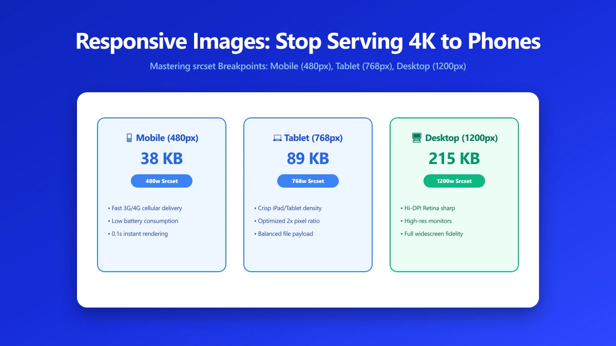
await sharp('photo.jpg').resize(800).webp({ quality: 75 }).toFile('photo-800w.webp');| Variant | Width | WebP q75 (photo) | Primary use case |
|---|---|---|---|
| xs | 400px | 20–60 KB | Mobile portrait, 1× phone, thumbnails |
| sm | 800px | 60–150 KB | Tablet, 2× phone, half-width desktop |
| md | 1200px | 120–300 KB | Full-width desktop (standard) |
| lg | 1600px | 200–500 KB | Retina / 2× DPR desktop, wide layouts |
| xl | 2400px | 400–900 KB | Hero images for large monitors only |
For most websites, three sizes, 400px, 800px, and 1600px, are sufficient. A fourth or fifth variant improves selection precision by under 5% while doubling storage and build time. Start with three.
The picture Element: Format Switching and Art Direction
The <picture> element solves two things srcset alone cannot: serving different formats (WebP vs JPEG) and different crops for different screen sizes (art direction).
<!-- Format switching: WebP for modern browsers, JPEG fallback -->
<picture>
  <source
    type="image/webp"
    srcset="photo-400w.webp 400w, photo-800w.webp 800w, photo-1600w.webp 1600w"
    sizes="(max-width: 600px) 100vw, (max-width: 1200px) 50vw, 800px"
  >
  <img
    src="photo-800w.jpg"
    srcset="photo-400w.jpg 400w, photo-800w.jpg 800w, photo-1600w.jpg 1600w"
    sizes="(max-width: 600px) 100vw, (max-width: 1200px) 50vw, 800px"
    alt="Product photo"
    width="800" height="533"
    loading="lazy"
  >
</picture>

<!-- Art direction: tight portrait crop on mobile, wide shot on desktop -->
<picture>
  <source media="(max-width: 600px)"
    srcset="photo-portrait-400w.webp 400w">
  <source media="(min-width: 601px)"
    srcset="photo-landscape-800w.webp 800w, photo-landscape-1600w.webp 1600w">
  <img src="photo-landscape-800w.jpg" alt="Product" width="800" height="533">
</picture>
Responsive Images and Largest Contentful Paint
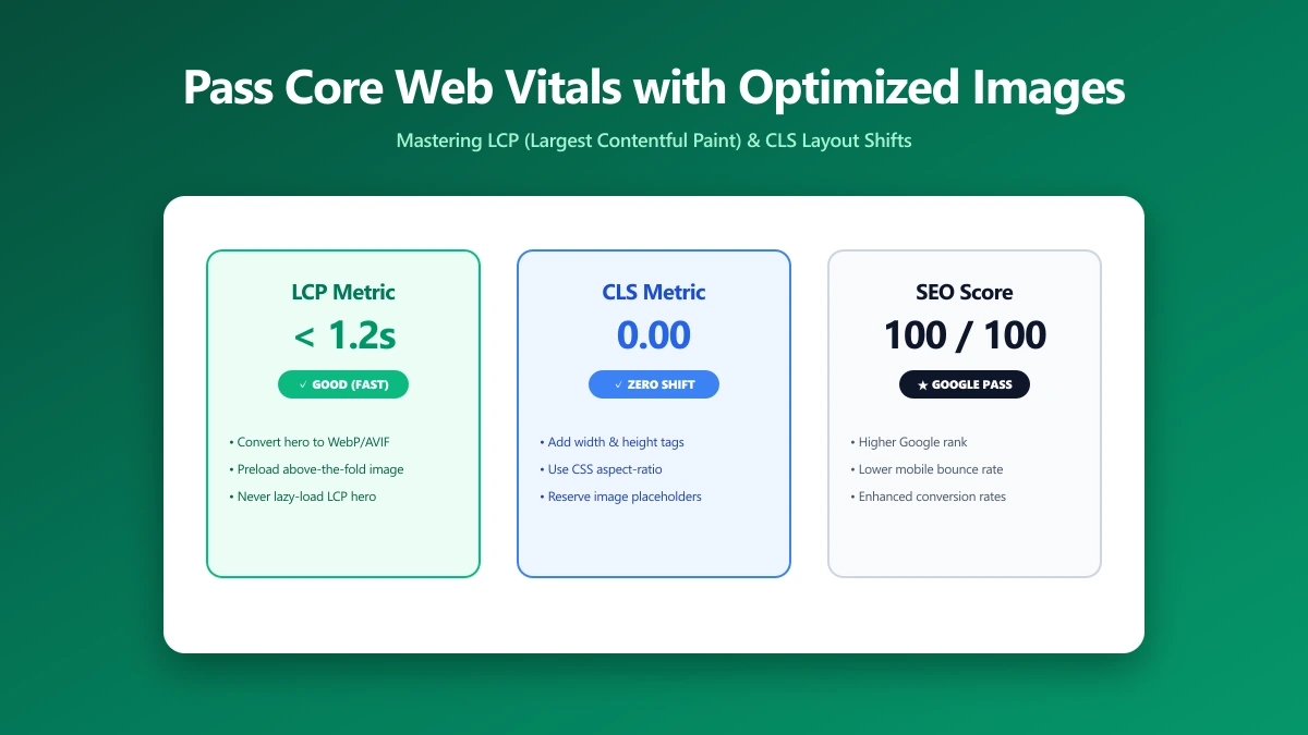
The LCP element on most pages is an image, the hero banner, the lead product shot, or the above-fold illustration. LCP directly affects your Core Web Vitals score and Google Search ranking. Responsive images affect LCP in two ways:
- ●File size: A phone that downloads an 80 KB WebP instead of a 2 MB JPEG sees LCP improve proportionally.
- ●Discovery priority: The browser's preload scanner finds
srcsetin HTML before any JavaScript runs. Images loaded via CSSbackground-imageare discovered late and always hurt LCP.
For your LCP image specifically: add fetchpriority="high" and remove loading="lazy". Lazy-loading the image that determines your LCP score is one of the most common and most damaging mistakes on the web.
Framework Shortcuts
- ●Next.js: The
<Image>component handles srcset, sizes, WebP/AVIF conversion, lazy loading, and aspect ratio automatically. Addpriorityprop for the LCP image. - ●Nuxt.js: The
nuxt/imagemodule provides the same capabilities with Nuxt's SSR pipeline. - ●Astro: Built-in
<Image>and<Picture>components with automatic build-time optimisation. - ●Cloudinary / Imgix / Bunny.net: CDN-level responsive images via URL parameters, resize and convert to WebP with
?width=800&format=webp, no build step needed.
Common Mistakes That Undo the Gains
- ●Wrong sizes value: Using
sizes="100vw"when the image is only 50% wide causes the browser to download 2× the necessary resolution. - ●Lazy-loading the LCP image:
loading="lazy"defers discovery of the most important image on the page, a direct LCP regression. - ●Missing width and height: Without explicit dimensions, the browser cannot reserve space before the image loads, causing layout shift (CLS).
- ●No WebP fallback: WebP is 25–35% smaller at equivalent quality and supported by 97% of browsers. Skipping WebP is free bandwidth savings you're not taking.
- ●Uploading oversized originals: If your largest srcset variant is 1600px, uploading a 6000px source wastes storage and CDN processing time. Resize to 1600px before uploading.
The Bottom Line
A single srcset attribute with three size variants is the highest-ROI performance improvement available for image-heavy pages. It requires no server, no CDN subscription, and no framework, just correctly sized source files and four lines of HTML. Use our image resizer to generate your 400px, 800px, and 1600px variants, then compress each one before deploying. Everything runs in your browser, nothing is uploaded.
Frequently asked questions
What is the difference between srcset and sizes?
How many size variants do I actually need?
Does using srcset affect SEO rankings?
What happens in browsers that do not support srcset?
Should I use srcset or a CDN image service?
Sources & references
This article was researched and written by Nikola, drawing on the following primary sources and documentation:
Ready to try it?
All tools run entirely in your browser, no uploads, no account required.
Resize Image