Those Weird Blotches Around Text: A Field Guide to Compression Artifacts
Summary
Blotchy gradients, halos around text, pixelated blocks, compression artifacts have specific names and causes. Learn what triggers each one and how to avoid them.
You compress an image, the size looks good, and then you zoom in. Blotchy squares in the background. A muddy halo around the title text. Gradient sky that looks like it's made of seven flat bands. These defects have names, specific causes, and specific cures, and once you can identify them, you can prevent them.
Compression artifacts are the visible byproducts of a lossy encoder discarding data it considers unimportant. The problem is that the encoder's definition of "unimportant" doesn't always match what human eyes find most distracting. JPEG was designed in 1992 for photographs displayed on low-resolution CRT monitors. At a time when screens were 72 PPI and users sat three feet away, its trade-offs made sense. On a modern 2× retina display at arm's length, the same trade-offs are visible in ways they weren't intended to be.
Blocking, The Grid Pattern
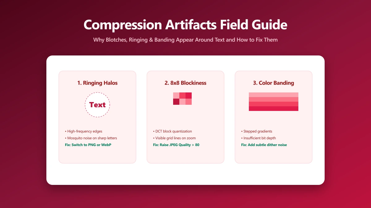
JPEG compresses images by dividing them into 8×8 pixel blocks and processing each independently. At high quality, the boundaries between blocks are invisible because adjacent blocks encode similar frequency information. At low quality, each block is quantised more aggressively, and the values at block boundaries diverge, making the grid pattern visible.
Blocking is most visible in smooth, low-frequency content: clear sky, skin tones, out-of-focus backgrounds. Natural texture and busy patterns tend to mask it. A portrait compressed to quality 55 might show severe blocking in the smooth background while the detailed hair and face look acceptable.
Blocking is the defining artifact of heavily compressed JPEG and the primary visual cue that makes people say an image "looks low quality." It's the reason JPEG is a poor choice for UI screenshots, where flat colour regions like toolbars and buttons expose the block structure immediately.
Ringing (Gibbs Phenomenon), The Halo Around Edges
The DCT (Discrete Cosine Transform) used by JPEG cannot perfectly represent sharp step changes in brightness, a mathematical limit known as the Gibbs phenomenon. At a sharp boundary (white button on dark background, black text on white, a hard shadow), the encoder produces oscillations: alternating bright and dark bands on either side of the edge.
In web screenshots and UI graphics, ringing makes text look surrounded by ghost shadows or halos. At quality 85 or above, the ringing amplitude is small enough to be invisible at normal viewing. Below quality 75, ringing becomes increasingly visible around high-contrast edges.
Mosquito Noise, The "Buzzing" Around Text
Mosquito noise is a subset of ringing that concentrates around text and other high-contrast, sharp-edged content. The name comes from the way small, rapidly-changing artifacts appear to swarm around letterforms at moderate zoom levels, resembling a swarm of insects. It's especially pronounced for dark text on white or very light backgrounds.
Mosquito noise is why JPEG is categorically the wrong format for screenshots, documentation images, or any image containing rendered text. At quality 80, text in a JPEG screenshot often has a visible halo effect that makes it look soft. At quality 60, individual letterforms become surrounded by visible noise clouds.
Colour Banding, Staircase Gradients
Smooth gradients, a blue sky transitioning to white at the horizon, a blurred shadow, a vignette effect, are represented as continuous tones. Both JPEG and 8-bit PNG quantise these tones into discrete steps. When the quantisation step is large enough to be visible, the gradient appears as a series of flat bands rather than a smooth transition.
In JPEG, banding is most pronounced below quality 70 in gradient-heavy images. In PNG, banding occurs when an image with smooth gradients is saved as PNG-8 (indexed colour, 256 colours maximum) instead of PNG-24 (true colour, 16.7M colours). Always use PNG-24 for images with gradients; PNG-8 is only appropriate for flat, low-colour-count graphics.
Chroma Subsampling Artifacts, Colour Bleeding
JPEG compresses the colour (chroma) channels at lower resolution than the brightness (luma) channel, using a scheme called 4:2:0 subsampling. In this scheme, one chroma value is shared across a 2×2 pixel block. For photographic content, this is invisible, human eyes are less sensitive to colour detail than brightness detail. For content with sharp colour boundaries (coloured text on white, logos), it causes colour to bleed outside the intended edges.
Red text on a white background, for example, often develops a pink halo around every letterform. This is the chroma value from the red pixels spreading into adjacent white pixels. WebP uses 4:4:4 chroma subsampling in its lossless mode and optionally in lossy mode, which eliminates this artifact, another reason WebP is preferable to JPEG for mixed content.
// Canvas API and chroma subsampling:
// The Canvas toBlob API does not expose chroma subsampling control.
// To avoid chroma bleeding on text/logos, use these formats instead:

// WebP lossless, no chroma subsampling, lossless, supports transparency
const canvas = document.createElement('canvas');
canvas.getContext('2d').drawImage(img, 0, 0);
const webpBlob = await new Promise(res => canvas.toBlob(res, 'image/webp'));

// PNG, always lossless, no chroma subsampling
const pngBlob = await new Promise(res => canvas.toBlob(res, 'image/png'));

// JPEG at Q90+, reduces but does not eliminate 4:2:0 chroma artifacts
const jpegBlob = await new Promise(res => canvas.toBlob(res, 'image/jpeg', 0.90));| Artifact | Format | Cause | Where it appears | Fix |
|---|---|---|---|---|
| Blocking | JPEG | Heavy 8×8 block quantisation | Sky, skin tones, blurred backgrounds | Raise quality above 75; switch to WebP |
| Ringing (Gibbs) | JPEG | DCT oscillation at high-contrast edges | Around sharp shadows, icons, text | Raise quality to 85+; use WebP |
| Mosquito noise | JPEG | Ringing concentrated around letterforms | Text overlaid on photos or UI | Use PNG or WebP lossless for text content |
| Colour banding | JPEG / PNG-8 | Gradient quantisation to discrete steps | Sky gradients, vignettes, shadows | Use 24-bit colour; raise quality above 75 |
| Chroma bleeding | JPEG | 4:2:0 chroma subsampling | Coloured text edges on white/light bg | Use WebP (4:4:4) or PNG; or quality 90+ |
| Posterisation | PNG-8 | Insufficient colour palette (≤256) | Photos or complex graphics | Use PNG-24 or WebP/JPEG instead |
Format Recommendations by Content Type
- ●Photographs (no text overlay): JPEG or WebP lossy, artifacts are minimal at quality 75+ and masked by natural texture
- ●Screenshots with text: PNG or WebP lossless, lossy formats create mosquito noise around every letter
- ●Mixed content (photo with text overlay): WebP quality 85+, handles both photographic and edge content better than JPEG
- ●Logos and icons (raster): PNG-24 or WebP lossless, never JPEG
- ●Logos and icons (vector): SVG always, infinite scalability, no artifacts at any size
- ●UI screenshots for documentation: PNG lossless, blocking and ringing on UI elements are immediately obvious at 100% zoom
How to Spot Artifacts Before Publishing
The key is checking at 1:1 zoom (100% pixel scale), not at the fitted view in your image editor. Most artifacts that are visible at 1:1 are also visible at normal web viewing distances on retina displays. Look in these areas first:
- ●Sky and smooth backgrounds: Look for blocking (grid squares) and banding (flat colour bands)
- ●Text and icon edges: Look for ringing (bright halos) and mosquito noise (grainy halos around letterforms)
- ●Coloured text on white: Look for chroma bleeding (colour spreading outside the letterform edges)
- ●Gradients and shadows: Look for posterisation (abrupt steps instead of smooth transitions)
In our image compressor, the before/after compare view lets you drag a split slider at any zoom level to compare original and compressed side-by-side. Zoom to 100% and drag across text edges and smooth gradient areas before saving.
The Multi-Generation Problem
Compression artifacts compound across multiple encode-decode cycles. If you export a JPEG at quality 80, then open it in another program and re-export at quality 80, you're not applying quality 80 to the original, you're applying it to an already-lossy version. Each generation of re-encoding accumulates new artifacts on top of the previous ones.
Always compress from the original source file, never from a previously-compressed version. If your only available source is a previously-compressed JPEG, raise the quality setting to 85–90 to avoid adding a significant new generation of artifacts to existing ones.
Bottom Line
Compression artifacts are predictable: they follow from the encoder's algorithm and appear in specific content types at specific quality levels. Blocking appears in smooth areas below quality 75. Ringing appears at sharp edges below quality 85. Mosquito noise appears around text at any JPEG quality below about 85. Chroma bleeding appears when JPEG is used for content with sharp colour boundaries. Match the format to the content type, WebP or PNG for text and UI, JPEG or WebP for photographs, and most artifacts disappear before you ever need to adjust quality settings.
Frequently asked questions
What causes blocky patterns in compressed images?
Why does text look blurry or surrounded by a halo after compression?
Why do gradients look like steps instead of smooth transitions?
What is chroma subsampling and why does it matter?
Can I fix compression artifacts in an already-compressed image?
Sources & references
This article was researched and written by Nikola, drawing on the following primary sources and documentation:
Ready to try it?
All tools run entirely in your browser, no uploads, no account required.
Compress Image