How to Pass Core Web Vitals with Optimized Images
Summary
Images cause 70% of LCP failures. This step-by-step guide diagnoses and fixes image-related Core Web Vitals issues to improve your Google ranking.
Your Google ranking now depends on how fast your pages feel to real users, not just to a Lighthouse audit. Core Web Vitals are the three signals Google uses to measure that experience: LCP (Largest Contentful Paint), INP (Interaction to Next Paint), and CLS (Cumulative Layout Shift). Images are the primary driver of poor scores across all three.
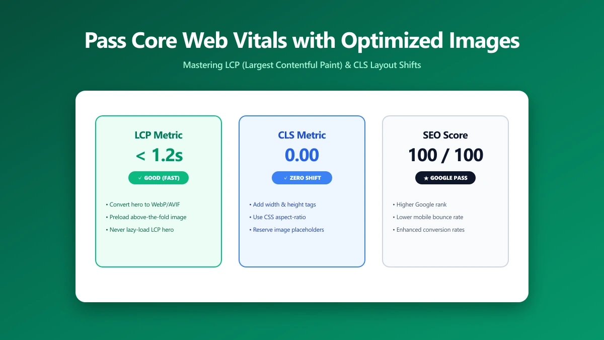
LCP measures how long before the biggest visible element loads. Images are the LCP element on roughly 70% of pages. CLS measures unexpected layout shifts, images without declared dimensions are a top cause. INP measures responsiveness, rendering large unoptimised images on the main thread can block interaction. Get your images right and you've solved most of your Core Web Vitals problem in one move.
This guide is a step-by-step diagnostic and fix process. Work through each step in order, most sites see their biggest gain from steps 1–3. If you want to start with the quick win, compress your images to the right size and format first.
Understanding the Three Core Web Vitals
| Metric | What It Measures | Good Threshold | Image's Role |
|---|---|---|---|
| LCP | Largest visible element load time | < 2.5 s | Primary cause, image is LCP element on 70% of pages |
| CLS | Unexpected layout shift magnitude | < 0.1 | Images without width/height cause layout shifts |
| INP | Delay from user interaction to response | < 200 ms | Decoding large images on main thread blocks interaction |
Step 1: Identify Your LCP Element
Before you can fix LCP, you need to know which element is causing it. Run this snippet in your browser console on the page you want to diagnose:
// Find the LCP element in the browser console
new PerformanceObserver((list) => {
  const last = list.getEntries().at(-1);
  console.log('LCP element:', last.element);
  console.log('LCP time:', last.startTime.toFixed(0), 'ms');
}).observe({ type: 'largest-contentful-paint', buffered: true });
Alternatively, run Lighthouse in Chrome DevTools → Performance Insights panel → look for the orange LCP marker on the filmstrip. If the LCP element is an image (which it is on most pages), proceed to step 2. If it's a text block, the fixes are different, focus on font loading and server response time instead.
Step 2: Diagnose the Image Bottleneck
With your LCP image identified, open Chrome DevTools → Network tab → filter by "Img" → click the image request. Look for these four failure patterns:
- ●File size over 100 KB on mobile: compress it, right-size it for the render width, or switch to WebP/AVIF.
- ●Format is JPEG or PNG: almost always compressible further without perceptible quality loss at screen resolution.
- ●"Queued at" timestamp is past 500 ms: the image is being discovered too late in the waterfall, it's either lazy-loaded incorrectly or buried in a CSS file.
- ●Initiator is a .css file: CSS
background-imageis invisible to the browser preload scanner and always discovered late.
CSS background-image is the single most common cause of avoidable LCP failures. The browser preload scanner cannot see background images declared in stylesheets. Move your hero image to an <img> tag with fetchpriority="high" and you will see an immediate improvement on most sites.
Step 3: Right-Size the Image for Each Viewport
Serving a 3,000×2,000 px image that renders at 390×260 px on a mobile screen wastes 99% of the bytes transferred. The browser has to download and decode all of them regardless. Calculate the correct source dimensions:
// Correct source width = render width × device pixel ratio
const renderWidth = element.getBoundingClientRect().width;
const targetWidth = Math.round(renderWidth * window.devicePixelRatio);
// Example: 390px container on a 2× screen → 780px source image is sufficient

// Serve the right size to each device automatically with srcset:
// <img srcset="img-780w.webp 780w, img-1560w.webp 1560w" sizes="100vw">
For responsive images, generate at least two breakpoints: one for mobile (1×) and one for desktop retina (2×). Use the sizes attribute to tell the browser the render width at each breakpoint, this is what allows it to pick the right srcset entry before layout is calculated.
Step 4: Compress to the Optimal Quality Setting
File size after right-sizing is a function of both resolution and compression quality. Use these quality targets as your starting point:
| Format | Quality Setting | Typical Size (1200×800) | Notes |
|---|---|---|---|
| JPEG | 75–80 | 60–120 KB | Visually lossless at screen resolution for most photos |
| WebP (lossy) | 75–80 | 40–90 KB | Equivalent to JPEG 85 at ~25% smaller size |
| AVIF | 60–70 | 30–70 KB | Best compression; slower to encode |
| PNG | Lossless / compression 9 | 100–400 KB | Only for hard-edge content (screenshots, logos) |
| WebP (lossless) | N/A | 80–300 KB | For transparency without PNG size penalty |
Never re-encode an already-compressed JPEG. Every encode cycle adds generation loss even at quality 95. Always compress from the original source file.
Step 5: Preload the LCP Image
Even a perfectly compressed image will fail LCP if the browser discovers it late. Preloading tells the browser to fetch the LCP image immediately on HTML parse, before it even starts processing stylesheets or scripts:
<!-- In <head>, fetched immediately on HTML parse -->
<link rel="preload" as="image"
  href="/images/hero.webp"
  imagesrcset="/images/hero-780w.webp 780w, /images/hero-1560w.webp 1560w"
  imagesizes="100vw"
  fetchpriority="high"
>

<!-- On the <img> tag itself -->
<img src="/images/hero.webp"
     srcset="/images/hero-780w.webp 780w, /images/hero-1560w.webp 1560w"
     sizes="100vw"
     fetchpriority="high"
     decoding="async"
     width="1560" height="1040"
     alt="Hero">
Step 6: Fix CLS by Declaring Image Dimensions
Every image without explicit width and height attributes causes a layout shift as the browser loads it and the page reflows. This directly harms your CLS score.
Always declare both attributes on every <img> tag, even for images with CSS max-width: 100%. The browser uses the declared aspect ratio to reserve the right amount of space before the image loads, preventing the shift entirely.
Step 7: Decode Off the Main Thread
Large images decoded synchronously on the main thread block user interactions, contributing to poor INP. Adding decoding="async" tells the browser to decode the image in a separate thread, keeping the main thread available for user input. Add it to every image that is not the LCP image.
Do NOT add decoding="async" to your LCP image. Async decoding can delay when the browser paints the element, increasing LCP time. Use it on secondary images only.
Step 8: Lazy-Load Below-the-Fold Images
Images below the fold that load eagerly on every page view consume bandwidth and delay the LCP image. Add loading="lazy" to any image that is not visible in the initial viewport. Do not add it to the LCP image, it will delay its load.
For more detail on how lazy loading interacts with LCP, read our post on the most common lazy-loading mistake that hurts LCP.
Measuring the Impact
After making changes, measure with PageSpeed Insights (which includes real-user Chrome data from the CrUX dataset) rather than Lighthouse alone. Lighthouse is simulated; PageSpeed Insights shows how real users on your actual traffic are experiencing the page.
Moving LCP from 3.2 s to under 2.5 s moves you from "Needs Improvement" to "Good", a meaningful ranking signal change. Moving below 2.0 s typically produces a measurable improvement in organic search rankings within 2–4 weeks as Googlebot re-crawls your pages.
The Bottom Line
Core Web Vitals failures trace back to images more than any other cause. Right-size, right-format, compress, preload the LCP image, declare dimensions, and lazy-load below the fold. That checklist, applied to the right images on your highest-traffic pages, will move your scores from red to green faster than any other single investment.
Start with the quick win: compress your images to the right quality and convert your hero image to WebP format, both take under a minute.
Frequently asked questions
What is LCP and why do images affect it?
Should I add loading="lazy" to my hero image?
Does image compression hurt image quality?
What is CLS and how do images cause it?
How long does it take for Core Web Vitals improvements to affect rankings?
Sources & references
This article was researched and written by Nikola, drawing on the following primary sources and documentation:
Ready to try it?
All tools run entirely in your browser, no uploads, no account required.
Compress Image