How Browsers Actually Handle Your Images
Summary
File size is half the story. After bytes arrive, browsers decode and composite images in ways that affect memory and rendering. Here's what actually happens.
You compress a hero image from 800 KB to 120 KB, check the Lighthouse score, and the LCP is still 3 seconds. The file is smaller, why is it still slow? Because file size and rendering cost are two different things. The browser's work begins when the download ends, and that work, decoding, rasterising, compositing, has its own cost in memory, battery, and time.
Most image optimisation advice stops at the wire: smaller file, faster page. Performance audits reinforce this because they measure bytes transferred. But a developer who understands what the browser does after receiving those bytes can find the optimisations that file size alone cannot fix: GPU memory pressure from oversized images, decode jank from large synchronous decodes, and layer explosion from over-eager will-change usage.
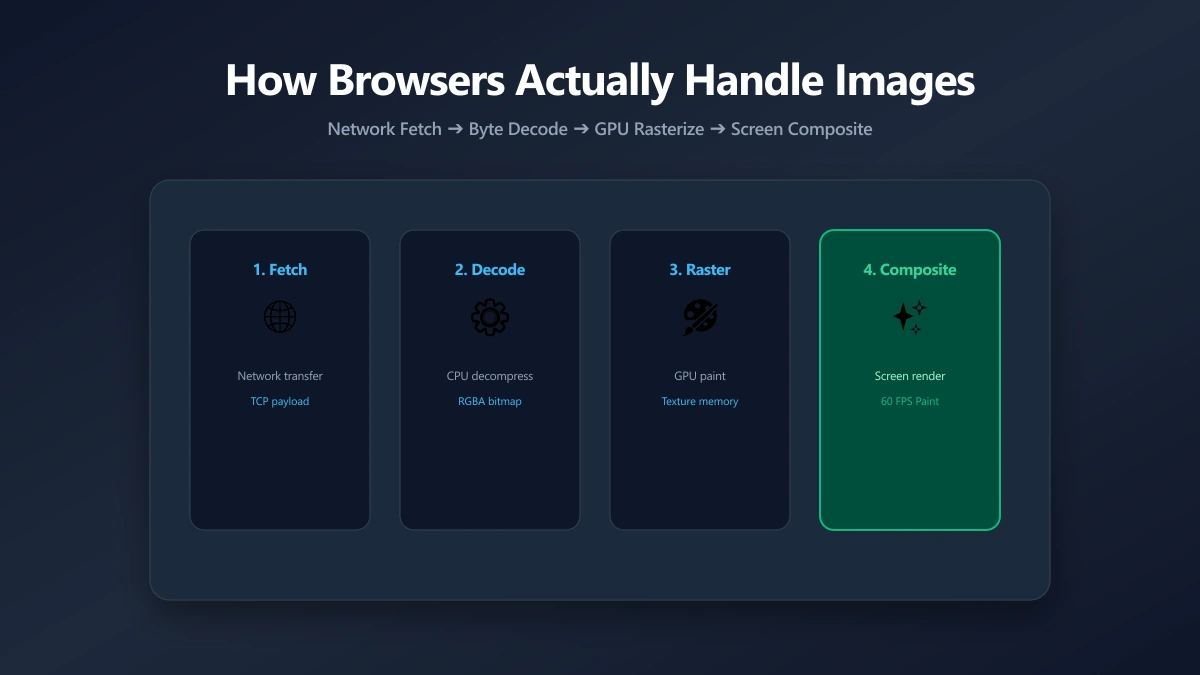
Step 1: The Network, Bytes Arrive
The browser's network stack fetches the image based on its priority. Priority determines when it starts downloading, which directly affects Largest Contentful Paint (LCP). Three attributes control image loading priority:
- ●
loading="lazy", defers the network request until the image is near the viewport. Use for all below-fold images. - ●
loading="eager"(default), starts the network request immediately. Correct for above-fold images. - ●
fetchpriority="high", signals that this is the LCP image. The browser boosts its priority in the download queue. Use on exactly one image, the hero.
<!-- LCP image: eager load, high priority, sync decode for guaranteed paint -->
<img src="hero.jpg" loading="eager" fetchpriority="high"
     decoding="sync" width="1200" height="630" alt="Hero">

<!-- Below-fold images: lazy load, async decode -->
<img src="gallery-1.jpg" loading="lazy" decoding="async"
     width="800" height="600" alt="Gallery image">
Step 2: Decoding, Compressed Bytes to Raw Pixels
The browser receives compressed image bytes (JPEG, WebP, etc.) and must decode them into raw RGBA pixel data before it can draw anything. This is a CPU-intensive operation. A 500 KB JPEG of a 2000×1500px photo decodes to 2000 × 1500 × 4 bytes = 12 MB of raw bitmap data held in memory.
This is why a gallery page with ten 3 MB JPEGs can consume 300+ MB of memory even if the total network payload was 30 MB. The compressed file size and the decoded memory footprint are completely different numbers. On mobile devices with 2–4 GB RAM, this matters significantly.
Decoding is synchronous by default, it blocks the main thread, delaying rendering. The decoding="async" attribute tells the browser to decode off the main thread, preventing jank on large images at the cost of a brief delay before the image appears.
| Attribute | Decodes on | When to use | Trade-off |
|---|---|---|---|
| decoding="sync" (default) | Main thread | LCP / above-fold hero images | Blocks rendering briefly, but guarantees timely paint |
| decoding="async" | Off main thread | Below-fold, gallery images, lazy-loaded content | No jank, but image appears slightly after scroll |
| decoding="auto" | Browser decides | When you're not sure | Inconsistent behavior across browsers |
Step 3: Rasterisation, Pixels Painted to GPU Texture
After decoding, the image is rasterised onto a GPU texture. This is where a critical optimisation opportunity lives: the CSS display size of an image has no effect on the GPU texture size. A 4000×3000px image displayed in a 400×300px CSS box still occupies a 4000×3000px GPU texture, wasting roughly 90% of that memory.
This is the argument for dimension right-sizing: a 400×300px image displayed at 400×300px (with a 2× retina version at 800×600px served via srcset) uses exactly the GPU memory it needs. The same image uploaded at 4000×3000px wastes 25× the GPU memory, for zero visual benefit at its displayed size.
Step 4: Compositing, Layer Assembly
The browser compositor combines image layers, applies CSS transforms, handles opacity, and sends the final frame to the screen. Most images live in the default layer and are composited together cheaply. The problem arises when CSS properties promote elements to their own compositor layer:
/* Layer promotion, use sparingly */
.animated-image {
  /* will-change promotes to own GPU layer */
  /* Use ONLY on elements that actually animate */
  will-change: transform;
}

/* Static images: no will-change */
/* They share the default layer and cost almost nothing to composite */
.product-photo {
  /* nothing, let the browser decide */
}

/* Danger: applying will-change to many elements = many GPU layers = OOM on mobile */
.grid-item {
  will-change: transform; /* BAD if applied to 50 grid items */
}Applying will-change to images in a large grid (product thumbnails, photo galleries) creates a separate GPU texture for every item. On a mobile device with limited GPU memory, this causes out-of-memory crashes or severely degraded performance. Only apply will-change to the specific element being animated, not to a container or grid item class.
Srcset: Letting the Browser Choose the Right Size
The srcset attribute solves the dimension mismatch problem at scale. You provide multiple image sizes; the browser picks the one that most closely matches the actual display size multiplied by the device pixel ratio. A 1x display at 800px wide downloads the 800px image. A 3x retina display at 400px wide downloads the 1200px image.
<!-- Provide 3 sizes; browser picks the appropriate one -->
<img
  src="photo-800.jpg"
  srcset="photo-400.jpg 400w,
          photo-800.jpg 800w,
          photo-1200.jpg 1200w"
  sizes="(max-width: 600px) 100vw,
         (max-width: 1024px) 50vw,
         800px"
  loading="lazy"
  decoding="async"
  alt="Product photo"
  width="800" height="600"
>
Memory Budget: What Your Images Actually Cost
| Image dimensions | Decoded memory | Displayed at | Memory waste |
|---|---|---|---|
| 4000×3000px (12MP) | 45.8 MB | 400×300px (CSS) | ~90% wasted |
| 2000×1500px (3MP) | 11.4 MB | 800×600px (retina) | ~75% wasted |
| 800×600px | 1.8 MB | 800×600px (1x) ✓ | None, correctly sized |
| 400×300px + 800×600px srcset | 0.4–1.8 MB | Matches viewport ✓ | None, browser picks right size |
The Practical Optimisation Checklist
- ●Right-size source images: Use resize to match display dimensions before compressing. An oversized image at quality 80 uses far more GPU memory than a correctly-sized image at quality 80.
- ●Use srcset for all non-decorative images: Provide at least 2× and 1× versions. The browser handles the rest.
- ●Set width and height on every img: Prevents Cumulative Layout Shift (CLS) and lets the browser reserve layout space before the image loads.
- ●fetchpriority="high" on the LCP image only: One image per page. Boosting multiple images defeats the purpose.
- ●decoding="async" on below-fold images: Prevents decode operations from blocking main-thread work as users scroll.
- ●will-change only on animated images: Never apply it to static images or to all items in a large grid.
Bottom Line
File size and rendering cost are different problems with different solutions. File size is solved by compression and format selection. Rendering cost is solved by dimension right-sizing, srcset, and careful use of loading attributes. The full optimisation stack requires both: a correctly-compressed image at the wrong dimensions still wastes GPU memory, and a correctly-sized image that loads at the wrong time still degrades LCP. Address both together and the performance wins compound.
Frequently asked questions
Why does my page use so much memory even after I compressed the images?
What does fetchpriority="high" do on an img tag?
When should I use decoding="async" vs decoding="sync"?
Does lazy loading affect Core Web Vitals?
What is will-change and when should I use it on images?
Sources & references
This article was researched and written by Nikola, drawing on the following primary sources and documentation:
Ready to try it?
All tools run entirely in your browser, no uploads, no account required.
Resize Image