How to Make Your Resume File Look Professional
Summary
Make your application look considered before the file is opened. Formatting and presentation tips for resume filenames and attachments.
Job seekers invest substantial effort in perfecting the content of their resumes. They draft clear summary statements, select elegant typography, and carefully format page layouts. However, a major part of your presentation happens outside the document. Before a recruiter opens your resume, they read the filename, check the file type, and verify the file size.
An application with a messy filename like resume_draft_v2_updated(3).docx or a massive 4MB file size signals a lack of polish before the recruiter reads a single word. Conversely, a clean, structured file name and format convey a candidate who is organized and detail-oriented.
To ensure your resume file makes a premium first impression, follow these formatting and presentation best practices.
The Psychology of First Impressions: Thin-Slicing the Filename
In psychology, the term thin-slicing refers to the human ability to find patterns and form opinions based on very narrow windows of experience. Recruiters are expert thin-slicers. Eye-tracking studies show that recruiters spend an average of six to seven seconds scanning a resume before making an initial fit decision.
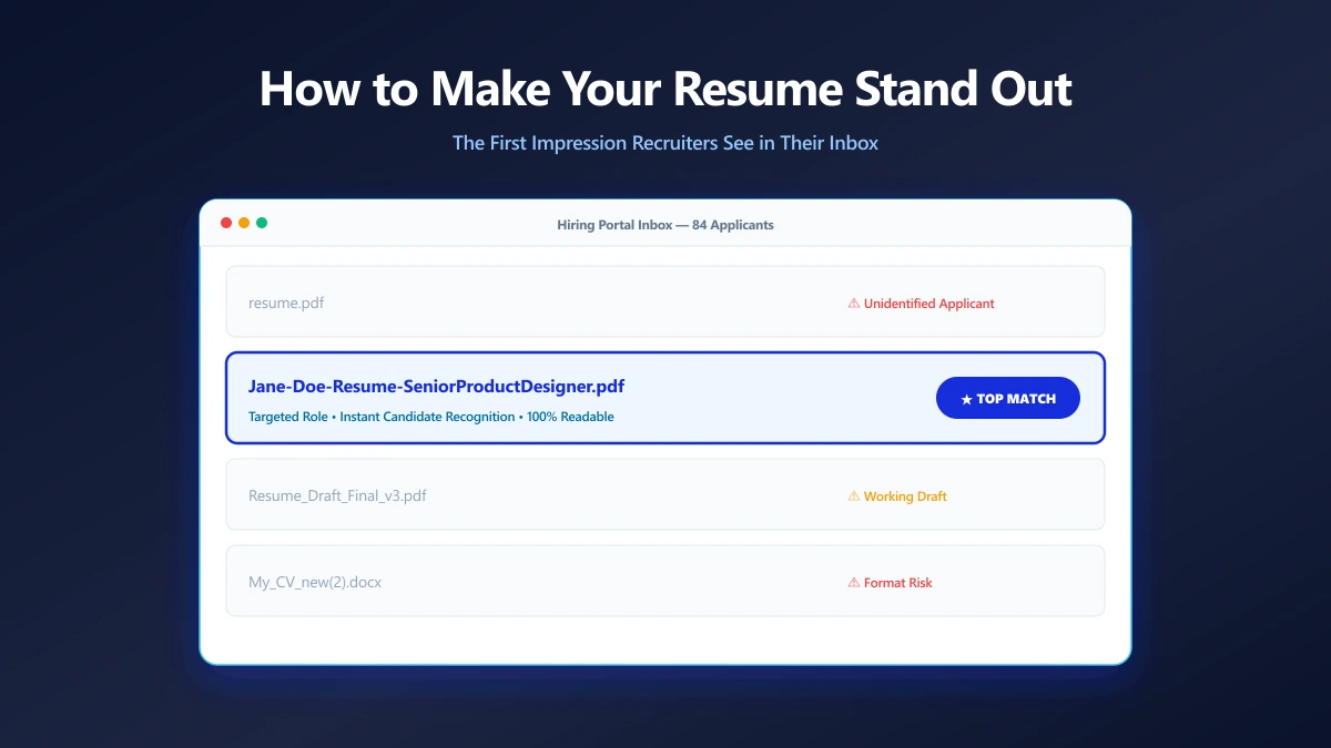
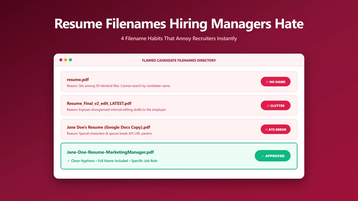
However, their subconscious evaluation begins even earlier. The moment your application email arrives or your file appears in their download queue, they see your filename. A file named resume-final-v3.docx triggers a split-second cognitive bias. It suggests the document was pulled together in a hurry, or that you are submitting working drafts.
On the other hand, a filename like Alex-Mercer-Resume-DataAnalyst.pdf indicates preparation and respect for the reader\'s time. This small positive bias prepares the recruiter to read your resume with a more favorable outlook.
1. Establish a Standard Naming Convention
Always use a consistent naming formula that identifies your name, document type, and target role.
The Recommended Formula:
FirstName-LastName-Resume-Role.pdf
Examples:
- ●Resume:
Alex-Mercer-Resume-DataAnalyst.pdf - ●Cover Letter:
Alex-Mercer-CoverLetter-DataAnalyst.pdf - ●Portfolio:
Alex-Mercer-Portfolio-DataAnalyst.pdf
Including the target role title signals that the resume was tailored specifically for that position, rather than sent in bulk.
2. Use the Right Separators
How you separate words in your filename affects both readability and technical compatibility with database portals.
- ●Hyphens (Recommended):
Alex-Mercer-Resume.pdfis clean, readable, and compatible with all modern systems. - ●Underscores (Acceptable):
Alex_Mercer_Resume.pdfis equally safe. - ●Spaces (Avoid): Spaces are converted to
%20on web portals, turning your clean file name intoAlex%20Mercer%20Resume.pdf.
3. Typography and Hierarchy of a Professional File
The choice of typography and type scale inside your resume has a significant impact on its readability. Professional documents use standard, screen-friendly sans-serif fonts such as Arial, Calibri, Helvetica, or modern web selections like Inter, Outfit, or Roboto.
Avoid using decorative, script, or non-standard fonts (like Comic Sans or papyrus). These fonts are hard to read and can trigger rendering bugs in tracking systems, resulting in overlapping characters or weird symbol displays.
Adhere to a clean type hierarchy: Your Name/Header: 18 to 24 points, bold. Section Headings (H2): 14 to 16 points, bold. Job Titles / Employers: 12 points, semi-bold. Body Text / Bullet Points: 10 to 11 points, regular weight. * Line Spacing: Set to 1.15 or 1.25. Avoid single-line spacing, as it runs text blocks together and reduces scanability.
4. Bottom Margins and the Page Spillage Bug
One of the most common layout issues is the "page spillage" error. This occurs when a resume that is intended to fit on a single page has a single bullet point or a small date block spill over onto a second page.
Leaving a heading or single line stranded on page two looks extremely unpolished. It suggests you did not verify the document layout after exporting.
To keep your document bounds neat: Margins: Keep margins between 0.5 inches (minimum) and 1.0 inch (maximum). If your content spills over slightly, reducing margins from 1.0 to 0.75 inches will pull the text back. Content Squeezing: Adjust the space between sections rather than shrinking your font size. Font sizes below 10 points are too small to read on mobile displays. * Grid Alignment: Keep a clean grid. Every bullet point should align to the same vertical guideline.
5. Visual Consistency and Color Coordination
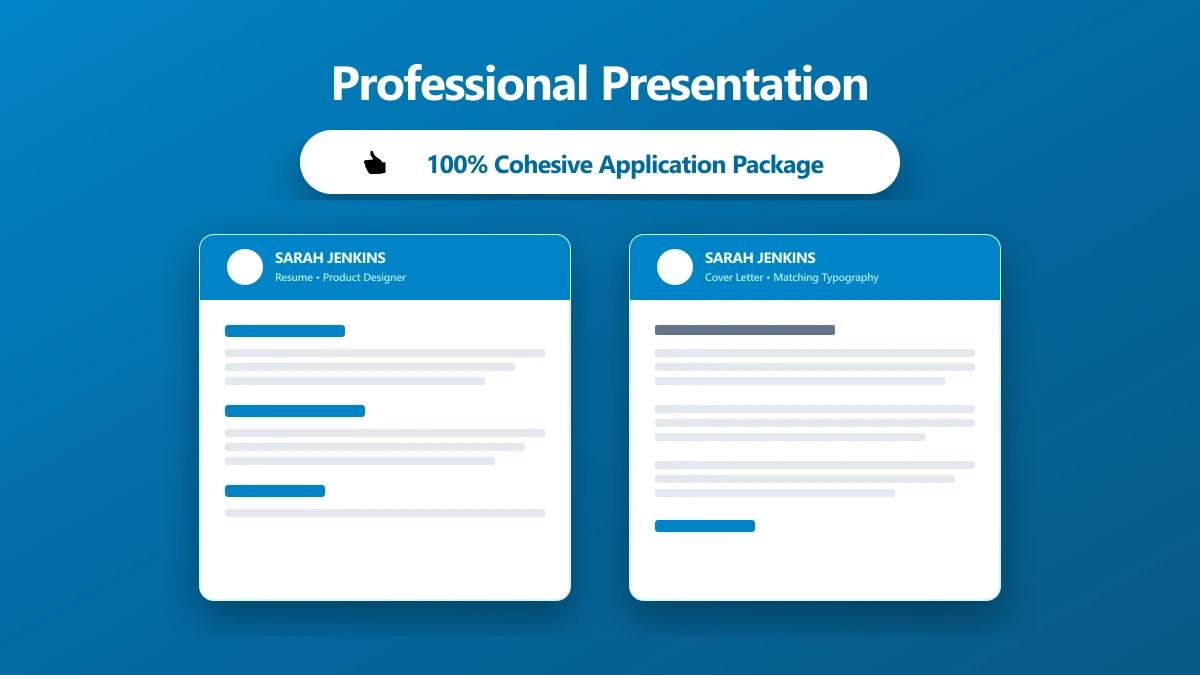
If you are submitting multiple files (such as a resume, cover letter, and reference list), use the same styling across the entire package.
- ●Match Your Header: Use the exact same name, contact info block, and font style at the top of your cover letter as you do on your resume.
- ●Coordinate Accents: If your resume uses a specific accent color (like a dark navy or a muted violet) for section headers, use the same accent color for your cover letter header.
- ●Font Matching: Never mix fonts between attachments. If your resume uses Calibri, your cover letter and references must use Calibri as well.
6. Avoid the Regional Paper Dimension Trap
Many modern resumes are designed using graphic platforms like Canva. While these tools offer excellent visual layouts, they introduce a common formatting bug: regional paper size mismatch.
If you use a template designed in Europe, it will default to A4 paper size (210 x 297 mm). If you submit this file to an employer in the United States or Canada (where the standard is Letter size, 8.5 x 11 inches), the layout will compress or stretch when printed or viewed in a portal. This can cut off text at the margins or push your final line onto a second page. * The Rule: Always check your document settings. If you are applying to North American roles, set your canvas size to Letter. If applying to European, Asian, or Latin American roles, set it to A4.
7. Keep the File Size Under 2MB (Managing DPI)
Hiring portals enforce strict upload limits. A text-only resume is usually under 500KB. However, if your resume contains custom graphics, profile photos, or scanned elements, the file size can easily exceed 2MB, leading to failed uploads.
This expansion in file size is usually caused by high-resolution images. A headshot or logo saved at 600 DPI (Dots Per Inch) is optimized for high-end print magazines, but is complete overkill for a digital screen, which only requires 72 to 150 DPI. * The Solution: Compress the file. Our PDF compressor runs locally in your browser using WebAssembly. It downsizes image resolutions to a screen-friendly 150 DPI while keeping text characters sharp, bringing your file size under the 2MB portal limit without affecting visual quality.
8. Clear Hidden Metadata
Word processors embed hidden details inside files, such as the author\'s name, company name, and original folder path. If you draft your resume at work or use a friend\'s template, this metadata can leak details you did not intend to share.
- ●The Fix: Strip the metadata. You can use our remove metadata tool to clear all hidden author, company, and location tags locally in your browser.
9. Export with Selectable Text (Not Scans)
Never submit a resume that was scanned from a physical printout. Scanned resumes are saved as flat images. The text cannot be read by applicant tracking systems, and the file will parse as a blank document.
- ●The Fix: Export directly to PDF from your word processor. Test the final file by opening it and confirming you can highlight and copy the text.
Professional Presentation Checklist
Use this comparison table to evaluate the presentation quality of your resume file:
| File Element | Professional Standard | Common Mistake | Risk |
|---|---|---|---|
| Filename | FirstName-LastName-Resume-Role.pdf | resume_final_v2.docx | Suggests disorganization and lacks name identifier. |
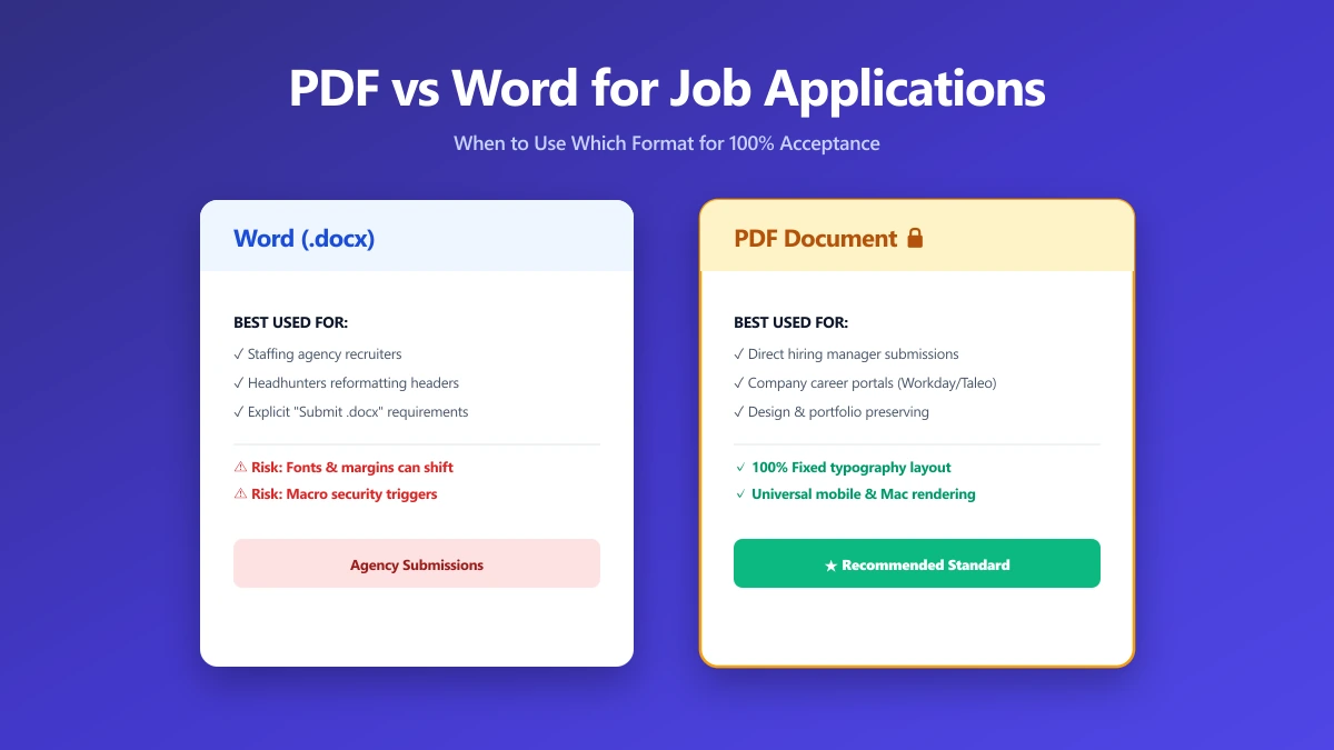
| File Format | PDF (.pdf) | Apple Pages (.pages) | Windows users will be unable to open the file. |
| Separators | Hyphens (-) or Underscores (_) | Spaces | Spaces turn into %20 on web upload portals. |
| File Size | Under 2MB | Over 5MB | Portal upload rejects the file without a clear error. |
| Text Layer | Live, selectable text | Flat image from scanned paper | ATS reads the document as blank. |
| Metadata | Cleared of author and company tags | Carrying current employer\'s software license | Leaks current employment context. |
| Paper Size | Match target region (Letter vs A4) | Mismatched canvas layout | Margins get cut off or text overflows. |
| Typography | Simple sans-serif hierarchy (10-12pt) | Script or decorative fonts | ATS cannot read the text, looks messy. |
Validating Your Document Appearance
Before sending your resume, run a final visual check:
- 1.Verify Font Embedding: Open the PDF on a different device (like your phone). If the fonts look different, they were not embedded correctly during export.
- 2.Confirm Alignment: Ensure that lines have not shifted, headers are not cut off, and no headings are stranded at the bottom of a page.
- 3.Double-Check Extensions: Confirm that your file is named
.pdf, not.pdf.docx(a common export error).
If you need to convert a Word document to a clean PDF, use our browser-native Word to PDF tool. It locks in your formatting and exports a clean PDF with your filename preserved, all while keeping your personal details secure on your device.
The Bottom Line
A professional resume file looks clean from the outside. Take the extra five seconds to format your filename, compress your file, and verify your document format.
Use the pattern FirstName-LastName-Resume-Role.pdf. Use hyphens, skip version numbers, and keep the file size under 2MB.
If your resume is complete, convert it securely with our local Word to PDF tool to lock in your presentation and ensure a premium first impression.
Frequently asked questions
How do I make my resume file look professional?
FirstName-LastName-Resume-Role.pdf, save it in PDF format with live text, keep the file size under 2MB, and clear all document metadata before submitting.What is the best format for a professional resume file?
Should I use spaces or hyphens in my resume name?
-) or underscores (_). Spaces are converted to %20 on web portals, making your file name look cluttered. Special characters like parentheses should be avoided entirely.How do I reduce the file size of my resume?
Can a recruiter see that I edited my resume recently?
What paper size should I use for my resume?
What typography guidelines should I use for a professional resume?
Sources & references
This article was researched and written by Nikola, drawing on the following primary sources and documentation:
Ready to try it?
All tools run entirely in your browser, no uploads, no account required.
Compress PDF